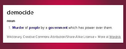
My writing buddy Ginny Stoner wanted me to get the democide word out but I hesitated. I hemmed and hawed, and kicked and screamed, right at this nice lady. I was in fear, Stoner-cold fear. I first called this Karmic Phobia, then learned a new word “karmaphobia”, which can manifest as anxiety about one's actions and their potential karmic consequences. I was possessed and needed to put out this post is part of my exorcism plan.
☞ You my friends need to face some nasty facts, and today I will give them to you direct from Ginny Stoner.
~Except for a couple of links I added, the post body below was written in its entirety by Ginny Stoner who approved Proton Magic to publish it. Contrary to my usual post where I personally have thoroughly (sort of) looked at the data and references, this post is just my way to float this information for public discussion~
US democide 2020: Part 1 Introduction and mortality data
This is Part 1 of a 3-part series on the possible democide that occurred in the US, and possibly worldwide, under the guise of COVID-19. Part 1 includes an introduction to the issues covered in this 3-part series, and goes over basic death data for the “Covid years” from the official US mortality records. Read Part 2 here and Part 3 here.
Introduction
Almost every time I comment about mortality during the “Covid years” (2020—2022) in an alternative media forum, someone claims deaths were normal in 2020 (because no virus/a weak virus/no contagion), while deaths in 2021 and 2022 were high (because vaccines).
On the other hand, a common mainstream belief is just the opposite—that deaths were high in 2020 (because COVID-19), while deaths in 2021 and 2022 were low (because vaccines).
Both beliefs are false, according to US mortality records, which show deaths were extraordinarily high in both 2020 and 2021, and to a lesser degree in 2022 as well.
Deaths were not just “Hmm, that’s interesting” high, or even, “That’s a little alarming” high—they were “OMG, WTH happened?!” high. I review the stunning death numbers in Part 1.
These numbers are a matter of record, not a matter of opinion or belief—everyone who does the same search in the mortality database will get exactly the same results. Therefore, they are something we should all be able to agree on, regardless of our opinions about the meaning or integrity of the data.
In Part 2, I demystify the concept of “excess deaths,” and show how it has been used to obscure the shocking death numbers in Part 1. In particular, the raw numbers show there were even more deaths in 2021, following the introduction of the Covid vaccines, than there were in 2020, and a higher death rate—not great statistics to claim a vaccine victory.
But, incredibly, it is possible to honestly claim excess deaths were much lower in 2021, or even that there were no excess deaths at all—even though the number of deaths and the death rate were at an all-time high that year.
I show how it works using 2 simple, legitimate methods of calculating excess deaths, which do not involve any deception. These methods show there were a mere 197 to 675 thousand excess deaths from 2020—2022, most of them in 2020.
Then, I use the same 2 simple, legitimate methods, but based only on pre-Covid death numbers—and get radically different results showing that, compared to the pre-Covid normal, there were an incredible 1.2 to 1.3 million excess deaths in the US during the Covid years, most of them occurring in both 2020 and 2021.
In Part 3, I review some of the strategies being used to conceal a possible mass-murder by government (a democide) by some means as yet unidentified, under the guise of COVID-19.
The mainstream approach (which I don’t cover here) is to conceal the mortality data, and blame any excess deaths on Covid, or failing to follow Covid treatment and prevention protocols, especially Covid vaccines.
The alternative approach (which I cover here) is to conceal the mortality data, and blame any excess deaths on Covid treatment and prevention protocols, especially Covid vaccines (i.e., the same things that prevented deaths, according to the mainstream narrative).
The obvious problem with alternative narratives is they tend to take the position there was no dangerous virus, either because viruses do not exist, or because the SARS-CoV-2 virus was not particularly dangerous. Therefore, there is no dangerous microorganism to blame the massive increase in deaths in 2020 on. As a result, excess deaths in 2020 are variously concealed, denied, minimized, dismissed with pat explanations, and/or discredited as fake—as long as no one mentions the possibility of intentional mass-murder, it’s all good.
☞ See this link on loving democides.
There are no analyses, as far as I know, that attempt to correlate the official narrative about the cause of excess deaths, or any of the widely repeated alternative narratives, with the US death waves during the Covid years. Instead, all rely on mere repetition by many for the appearance of credibility. I suspect these types of analyses would not support any of the usual narratives—and that’s why we don’t see them all over, everywhere, like we would in a sane world where evidence mattered more than rhetoric.
Like Steve Martin, the media is waiting for a sign the killing was intentional, not caused by a fictional virus, or a global plague of synchronous gross incompetence.
But, there is no proof of democide, you are probably thinking. Fair enough—I don’t claim to have proven it. In fact, I’ve barely dug into the evidence of what really killed all those people during the Covid years.
I do, however, claim the mortality data screams the possibility of democide, even to a casual observer—especially if you accept the proposition that no SARS-CoV-2 virus exists (but even if you don’t).
And, I claim that, in a world with a truly independent media, uncovering the real reason for the massive increase in deaths in 2020 and 2021 would be among the top news stories of our time—and we would not be satisfied with pat explanations with no real evidence to back them up, like we are now.
I guess, like Steve Martin in The Man with Two Brains, the alt-media is just waiting for a sign of democide. They’ll keep on the lookout for it…meanwhile, they’ll keep the screaming mortality data in the closet.
The basic mortality data
The numbers here are from the official source of US mortality data, known as WONDER. This database is available to, and regularly used by, government agencies, private companies, academia, researchers, investigators, and anyone else who wants to look at it. No registration is required to access the database, only agreement to the terms of service with each use. In the Notes section, I’ve provided both the suggested citation from WONDER, and a link to the saved search, so you can quickly and easily run it yourself to verify the numbers.
The contents of WONDER are collected from death certificates issued in counties nationwide.
This database has extensive search capabilities for criteria such as the date, state and county of death, age, gender, place of death (hospital, home, etc.), the underlying cause each death was attributed to, and up to 20 multiple causes deemed to have contributed to the death. It is a veritable goldmine of evidence about what really killed all those people during the Covid years—a mostly untapped goldmine.
The numbers shown here are the total number of US deaths recorded from all causes by year and by week, period. They have nothing in particular to do with Covid—they do not distinguish so-called “Covid deaths” from other deaths, and have nothing to do with “Covid cases” or the legitimacy of Covid testing or diagnoses. While these issues are important, they are also frequently used to subvert discussion about the far more important topic of what killed so many people.
The numbers shown here also have nothing to do with “excess deaths,” which are covered in Part 2. If anyone tries to raise doubt about these numbers based on the idea that excess deaths can be easily manipulated, then they either don’t understand the numbers, or they are doing the manipulating. The manipulation of excess deaths is totally irrelevant to the number of all-cause deaths recorded in the database.
The death numbers shown here have not been manipulated in any way to make them look shocking—they look shocking because they are shocking—even more so if you look at deaths going back to 1968, which you can do on the first page of Chapter 1 of my book, The Illustrated US Mortality Guide.
Yearly US deaths 1999—2023
Chart 1 shows the total number of yearly US deaths from all causes from 1999 thru 2023 (in green columns), and the death rate per 100,000 (orange line). The death rate per 100,000 is calculated by dividing the number of deaths that year by the population size, and multiplying the result by 100,000. This chart shows the “raw” or “crude” death rate, meaning it has not been adjusted for the age of the population or anything else. (Note 1)


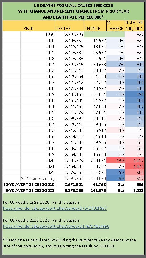
Table 1 also shows the number of yearly deaths from all causes and the death rate per 100,000 from 1999-2023. And, it shows the change and percent change in deaths from the prior year. The percent change and death rate are highlighted with a red-white-blue gradient, with the highest numbers in red, and the lowest in blue. (Note 1)
The years 2020—2022 stand out as years of extraordinary mortality. The increase in deaths in 2020 was 6 times larger than the largest previous increase (19% compared to 3% in 2015 and 2017).
The number of deaths remained high in 2021, and increased another 2% that year—a typical increase—before declining dramatically in both 2022 and 2023.
In 2020, the death rate skyrocketed to 1,027 per 100,000, up from 870 in 2019. The death rate increased again to 1,044 per 100k in 2021, before beginning a steep decline and ending up at 927 per 100k in 2023—much higher than it was in 2019, or any time prior to the Covid years.
Weekly US deaths 2020—2022: Death waves
Chart 2 shows weekly deaths from all causes from 2020 through 2022 (in blue columns), compared to weekly deaths in 2019 (in brown columns). Chart 2 also notes when the World Health Organization (WHO) declared a global pandemic (March 11, 2020) and when the Covid vaccines were introduced (December 14, 2020). (Note 2)
Deaths came in a strange series of waves, spikes, or surges during the Covid years, each resembling a “normal distribution” or bell curve—very different from the usual historical pattern, in which weekly deaths gradually increase in winter and gradually decline in summer, as they did in 2019, and in every other year before it going back to at least 1968. You can see a chart showing this predictable pattern of deaths, which was radically altered during the Covid years, on the first page of Chapter 3 of The Illustrated US Mortality Guide.
Each of the death surges primarily affected only a handful of states—although deaths increased overall in all states in the US over the Covid years. For tables showing how much deaths changed in each state, each month in 2020, 2021, and 2022 (compared to the 2018-2019 average) see this page. But, keep in mind that deaths also varied a lot by county, so deaths could have been normal in some counties in states where deaths were high, and vice versa.
One key to figuring out why so many people died in the Covid years, is figuring out why death surges began and ended when and where they did. It is a basic, fundamental issue—yet I haven’t seen any serious attempts to correlate the US death waves with any theory of causation. If any are out there, I would love to see them.

I recently saw a claim that an analysis of some kind is out there showing “waves of deaths congruent with administrative and political actions.” The analysis was nowhere to be found, unfortunately—but it is exactly the type of analysis we should be seeing many of by now, to support every theory out there about the causes of excess deaths during the Covid years—if the people promoting these theories took them seriously.
Simultaneous worldwide death spikes in Spring 2020
The first US death spike started right after the WHO declared a global pandemic—known as the New York City mass casualty event (more on this below).
Similar huge death spikes occurred simultaneously worldwide, including in Canada (story here—scroll 1/3 down to “The Canada Spring 2020 mass casualty event”) and in England, Wales, and elsewhere (story here—scroll 1/3 down to “Death spikes around the world following the WHO pandemic declaration”). All these death spikes lasted about 8—11 weeks.
Presumably, all these simultaneous death spikes right after the WHO’s pandemic declaration had the same cause. According to the official narrative, that cause was COVID-19, a disease caused by a virus named SARS-CoV-2.
I’m a little fuzzy on the details, but as I understand it, The Virus stealthily made its way around the world without detection sometime in early 2020, then laid in wait for the WHO to declare a pandemic on March 11, at which point The Virus unleashed an 8-11 week death siege on multiple global targets simultaneously.
This proved beyond any reasonable doubt that The Virus not only exists, it is intelligent, works cooperatively to strategically plan and execute attacks on humanity, and, most likely, has a very well-organized global transportation system and conference schedule.
☞ Here you can see documents proving “Covid-19 test kit” patents were made in 2015, “Covid-19” test kit imports started in 2017, and the Corona Virus Aid, Relief, and Economic Security Act (the CARES ACT) was submitted to congress in January 2019, almost an entire year before any coronavirus infections were noted in the media. You can tell your normie friends there are only 2 choices: 1. you believe in virus conspiracy, or 2. you believe in time travel conspiracy.
The New York City mass casualty event
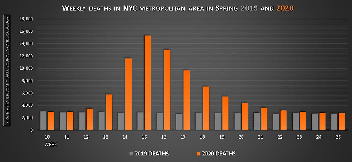
The first death spike in the US increased deaths more than 60% in April 2020 in the states of Connecticut, District of Columbia, Massachusetts and Michigan—but by far the greatest impact was in the New York City metropolitan area, located in the states of New Jersey and New York, where deaths increased up to 550% in 25 counties over 8 weeks, killing 50,000 extra adults of all ages, after which deaths returned to normal.

You can see basic mortality data for the New York City mass casualty event here, and I also have a blog category for this event here.
Key aspects of this event include that deaths increased by a similar percentage for adults of all ages, while children were unaffected; deaths increased a lot in both medical facilities and at home; deaths did not increase much in most of the rest of the US; and deaths involving many different organs and body systems increased, especially respiratory issues.
Could any of the usual explanations for excess deaths in the Covid years have caused the patterns and characteristics of deaths seen in the NYC mass casualty event? This is known as the NYC mass casualty event litmus test—and, as I showed recently, none of the most commonly repeated alternative explanations can pass this test.
***
NOTES
HOW TO RUN A SAVED WONDER SEARCH: Click the link and agree to the terms of service—no registration is required. The search should run automatically, and take you to the “Results” tab, where you can view, copy, or download the results. To see a detailed description of the search criteria, or to modify the search, go to the “Request Form” tab.
1) US all-cause deaths and death rate per 100,000 - 1999 thru 2023.
For deaths from 1999-2020, run this search: https://wonder.cdc.gov/controller/saved/D76/D403F967. Citation: Centers for Disease Control and Prevention, National Center for Health Statistics. National Vital Statistics System, Mortality 1999-2020 on CDC WONDER Online Database, released in 2021. Data are from the Multiple Cause of Death Files, 1999-2020, as compiled from data provided by the 57 vital statistics jurisdictions through the Vital Statistics Cooperative Program. Accessed at http://wonder.cdc.gov/ucd-icd10.html on Aug 26, 2024 9:21:28 PM
For deaths from 2021-2023, run this search: https://wonder.cdc.gov/controller/saved/D176/D403F968. Citation: Centers for Disease Control and Prevention, National Center for Health Statistics. National Vital Statistics System, Provisional Mortality on CDC WONDER Online Database. Data are from the final Multiple Cause of Death Files, 2018-2022, and from provisional data for years 2023-2024, as compiled from data provided by the 57 vital statistics jurisdictions through the Vital Statistics Cooperative Program. Accessed at http://wonder.cdc.gov/mcd-icd10-provisional.html on Aug 26, 2024 9:28:18 PM
2) US weekly death 2020-2021 compared to 2019. Run this search: https://wonder.cdc.gov/controller/saved/D176/D403F977. Citation: Centers for Disease Control and Prevention, National Center for Health Statistics. National Vital Statistics System, Provisional Mortality on CDC WONDER Online Database. Data are from the final Multiple Cause of Death Files, 2018-2022, and from provisional data for years 2023-2024, as compiled from data provided by the 57 vital statistics jurisdictions through the Vital Statistics Cooperative Program. Accessed at http://wonder.cdc.gov/mcd-icd10-provisional.html on Aug 26, 2024 10:52:36 PM
So what caused the excess deaths in 2020 that Ginny reports? Ginny does not commit to a specific cause, and neither will I, but I did write a post last month that my shed some light, or at least some EMF waves, on all this darkness:
☞ Just a note on comments. Ginny and Omar Jordan (
) had a very lengthy debate in the comment section on a past post here:I might not normally let a argument debate go on so long, but the topic is quite important. Today though we need to make sure the readers are not overwhelmed with debate. If Omar wishes to make a comment and Ginny a reply, please keep it to one comment each. If there is more, I can suggest they take the dirty details out to another forum and leave links for us in the comments. To be fair though, I am also happy to offer my SS as a means for Omar to publish his side of the 2020 death data. He is welcome to send me a SS chat on that if he so wishes.
Bad Karma is for Bad Apples in the bunch


I've had this conversation before.
I was WIDE AWAKE in 2020, I knew what was going on from about March.
I REMEMBER looking at Death Rates in early 2021, for the year 2020.
THEY WERE LOWER THAN NORMAL,a little bit. When I remember things, I bloody well remember them. I have no gain by saying this, other than that is what I remember. And then they were CHANGED to be HIGHER than usual for 2020.
This is part of the FUCKERY that we are served up. And the fuckery didn't START with "Covid," which is an entirely cockamamie bullshit "disease" anyway, because it's actually EMF's. Those first two weeks of the "pandemic," when we were all told to stay home, don't go outside, etc etc... There was a very very busy bunch of guys all over the place, erecting 5G towers.
You can think/believe/say whatever you like, and yes, it WAS/IS stone cold democide, but those numbers were manipulated, plain and simple. 2020 was slightly LESS than "normal."
This report lines up reasonably well with what I have observed. I am not a journalist or analyst by trade, and I don't go deeply into the numbers, although I am a database designer and developer and I know plenty about those. In 2020 I monitored daily hospitalization and death counts as reported by my county, and noted that there was nothing unusual going on there. I wasn't able to readily locate the baseline data that I wanted from earlier years -- it seemed to have disappeared off the Web -- but I did locate enough information to estimate what typical rates would be, thanks to an organization that obtained and published some pertinent data by means of a lawsuit.
The county, however, was also reporting daily "covid cases". I located the data dictionary for their database and confirmed that a "case" meant a positive "PCR test" within 30 days of whatever -- in other words total nonsense -- and I ignored these "cases" that were simply being used to frighten people. Apart from the flawed approach to diagnosis, each individual test was being counted as a case, so when a person was tested more than once, each test counted as a separate case. Reasonable methods were available to reduce reporting error, but none of that was being done. It was quite clear what was going on.
There appeared to be "hot spots", the closest one to me being San Francisco, and I couldn't account for that, but I was aware that there was an artificial pattern in their appearances, not characteristic of a global spread of disease.
Another measure that I still use use is illness and death as reported in a number of church prayer lists that I receive. There was an uptick in 2020 that continues to the present, and appears to be increasing over time. Comparing now with pre-2020, I see indications of increases in disease and death across all ages. In my own church's prayer list, the number of people in care homes and hospice is shrinking, but it is because they are dying. Five people died this last week, up from 0-2 per week, but it's December and deaths increase in this season.
There is nothing particularly accurate about my monitoring, but it provides me with a sanity check on the assessments I receive from other sources.